
hi every one i am kinda new in the forum and also in the profession so every coment will be very welcome and any advice will me very apreciate
thos are make by the dragonefly
see ya
Results 1 to 7 of 7
Thread: Truly red with DragonFly
-
06-26-2011, 10:43 PM #1Junior Member

- Join Date
- Jun 2011
- Location
- san diego
- Posts
- 16
- Post Thanks / Like

Truly red with DragonFly
-
Post Thanks / Like
 otto liked this post.
-
06-27-2011, 01:41 AM #2Knows Whats Up!

- Join Date
- Jun 2011
- Location
- Los Angeles
- Posts
- 580
- Post Thanks / Like
cool designs. Reminds me of buena vista tattoo club. heard of them?
-
06-27-2011, 10:49 AM #3Administrator/The Site Owner


- Join Date
- Aug 2010
- Location
- Toronto, Canada
- Posts
- 2,054
- Post Thanks / Like
[QUOTE=foxxmax;10900]hi every one i am kinda new in the forum and also in the profession so every coment will be very welcome and any advice will me very apreciate [QUOTE]
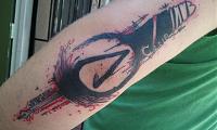
Looks great - black and red always look good together. My advice might be to be careful with your details if you want your tattoos to look good over the years. Especially the second one - you have some very small lettering (which you did very nicely) and some 'cutout' lettering where it's skin-colored. Consider doing lettering a little bit larger (and use small groupings - 3r maximum) and leave a little more skin open when you are doing the cutouts. That way, you'll still be able to read it easily for many years to come. Not too bad for a GIRL, eh?
-
06-27-2011, 02:54 PM #4Knows Whats Up!
- Join Date
- Jan 2011
- Location
- doncaster
- Posts
- 1,467
- Post Thanks / Like
You've done a very good job. Alie's advice is sound of course,however, sometimes the client may insist on certain things.
-
06-27-2011, 04:24 PM #5Machine Builder


- Join Date
- Dec 2010
- Location
- San Jose & Morgan Hill,CA
- Posts
- 4,133
- Post Thanks / Like
love the first one ! like the second one but wish the pin nib.shaft area was a bit bigger and yea the lettering just a tad big so its more legible and will hold up but like peter said some times its what the client wants-althoe its up to you to steer them the right way.
Overall nice work!
SSI -SUPER SLICK IRONS-top shelf custom coil machines
American Made Machines
[email protected]
https://www.facebook.com/evanstattooing
-
06-27-2011, 10:24 PM #6Senior Member
- Join Date
- Feb 2011
- Location
- fayetteville
- Posts
- 112
- Post Thanks / Like
yep........ Originally Posted by spoonertattoos

-
06-27-2011, 11:04 PM #7Junior Member
- Join Date
- Jun 2011
- Location
- san diego
- Posts
- 16
- Post Thanks / Like
hello spooner i didnt know them but hell yeah its very impressive work and its exactly the kind of art i like thx you very much
thx for this advise next time i will put the design here before to have also some feed back Originally Posted by slicksteel
yes thx for the advice for the tiny detail i used the 3round needle and try to turn up the voltage, make the pressure harder and try to dont push the needle too much (as less as possible) cause it looks lie blury ( let me know if i am wrong) and for the first tattoo its the first time i used the very red from fusion and wooooow this ink is magic it stay a way more easaly and its very intence anyway thx you for the advice and i will keep sending new stuff and watch your stuff se see how you work Originally Posted by Alie K
Last edited by foxxmax; 06-27-2011 at 11:16 PM.

 Reply With Quote
Bookmarks