
Did this lil guy a couple of weeks ago....
Vivace 9mag bugpin, Capo 5rl
Results 1 to 6 of 6
Thread: Cherry blossom branch
-
08-02-2012, 02:16 AM #1Senior Member


- Join Date
- Jan 2012
- Location
- Fayetteville, NC
- Posts
- 387
- Post Thanks / Like

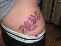
Cherry blossom branch
-
08-02-2012, 03:32 AM #2Knows Whats Up!

- Join Date
- Oct 2011
- Location
- Bellevue, Washington.
- Posts
- 2,724
- Post Thanks / Like
Looks good, bright colors and definitely could not be the easiest canvas to stretch. The flowers look nice and the shading is clean and solid. On an artistic note I think the branch would have benefitted from darker shading and more defined twists and knurles, some parts are a bit pale and 'wiggly' without purpose if that makes sense, but nothing a bit more time couldn't help. As the saying goes you can always add more but it's harder to take it away, right? haha. Clean tattoo bro

-
08-02-2012, 06:10 AM #3Member

- Join Date
- Feb 2011
- Location
- York England
- Posts
- 64
- Post Thanks / Like
Same as the above, this is lovely and clean, spot on :-) Originally Posted by Sage Oz

-
08-02-2012, 07:19 AM #4Knows Whats Up!

- Join Date
- Dec 2011
- Location
- .?.
- Posts
- 518
- Post Thanks / Like
Excellent skills, like the grey lines around flowers, looks natural, although careful with making a thing natural, it can look like one is trying too hard, as sage said a tiny bit wiggley!. Of course you are getting the hardest observation here, I'd say customer loves it. Lovely blends and like the lines of colour on the leaves, means that you probably look at everything around you to notice something like this, and that is the mark of an Artist. Personally I would have added a few dots of white, onthe leaves, but thats me..
-
08-02-2012, 08:22 PM #5Senior Member
- Join Date
- Jan 2012
- Location
- Fayetteville, NC
- Posts
- 387
- Post Thanks / Like
Cool, thanks guys.
Stretch-wise, I hate the love handle area. This one was no different.
I agree with the darker shading on the branches. The darkest brown in the branch was Fusion's Power Brown. Intenze's dark brown is just as light. I guess next time I'll need to add some black to get it good n dark.
Yeah, more knots and twists would have been good. I think that was the purpose in the wiggly sections of the branch. I could have used the recesses in those to add depth, but I didn't... next time.
Thanks for the observations and criticisms.... thats what helps us grow.
-
08-04-2012, 11:29 PM #6Administrator/The Site Owner


- Join Date
- Aug 2010
- Location
- Toronto, Canada
- Posts
- 2,054
- Post Thanks / Like
Blech. I hate tattooing that area too! I usually use at least one pillow under them, sometimes two so I don't actually have to stretch as much. Looks nice and clean. I'm a fan of the teal 'background' myself (when people let me do it!)
Not too bad for a GIRL, eh?

 Reply With Quote
Bookmarks