
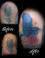
Some of you might remember a past thread regarding this cover up. His previous tattoo is the "typical Costa Rican" tattoo. They are all near this quality, if not worse.
Him and I finally got the time to finish this project up. We did the linework on a previous date and just did the color today (6.5 hours).
Used a Bishop Capo 3.5 (9mag bugpin), Infinite Irons coil (7rs)
Criticism is welcome and encouraged. Thanks for looking!
Results 1 to 7 of 7
Thread: Raven cover up
-
08-23-2012, 01:57 AM #1Senior Member


- Join Date
- Jan 2012
- Location
- Fayetteville, NC
- Posts
- 387
- Post Thanks / Like

Raven cover up
-
Post Thanks / Like
 Wonderland liked this post.
-
08-23-2012, 02:54 AM #2Knows Whats Up!

- Join Date
- Nov 2011
- Location
- Brasilia - DF
- Posts
- 1,216
- Post Thanks / Like
beautiful, man
https://www.facebook.com/gustavo.aragao
instagram - gusaragao
4 spektra halo (3.6,3.2,4.0) 1 Direkt
-
08-23-2012, 03:39 AM #3Knows Whats Up!

- Join Date
- Oct 2011
- Location
- Bellevue, Washington.
- Posts
- 2,724
- Post Thanks / Like
Damn solid coverup! He's proud now I bet!
-
08-23-2012, 09:23 AM #4Knows Whats Up!

- Join Date
- Mar 2011
- Location
- Fayetteville
- Posts
- 765
- Post Thanks / Like
Not feeling this one at all. Not saying its bad but it aint good either. Those roses are horrible 1990's flash roses and they suck. The bird is way too blue. If you would have completed the raven fully in black and gray then just brushed in some blue tones it would have looked a lot nicer.
There is something about that back wing that isn't right. I think if you would have gone more silhouette maybe? I dont know its just not working.
You did a light source across the belly of the bird but no where else, not on the roses, nothing. If your going to do that effect you must carry it thru out the entire piece.
I am going to get you working with larger needle groups too, when you get here. I am looking forward to working with you.
-
08-23-2012, 11:37 AM #5Machine Builder


- Join Date
- Dec 2010
- Location
- San Jose & Morgan Hill,CA
- Posts
- 4,133
- Post Thanks / Like
I agree the bird has to much blue which makes it not look like a ravan at all(as does the body shape around the stomach).I dont have a problem with the style of roses but they would have been done better in smooth feathered out layerd reds or smooth high contrast bng. The whole piece could have also been done in traditional style all with just heavy whip shading for that classic look.You do put out some very nice bng work thoe so keep up the hard work!


SSI -SUPER SLICK IRONS-top shelf custom coil machines
American Made Machines
[email protected]
https://www.facebook.com/evanstattooing
-
08-23-2012, 12:38 PM #6Senior Member
- Join Date
- Jan 2012
- Location
- Fayetteville, NC
- Posts
- 387
- Post Thanks / Like
Thanks for the feedback. The things pointed out were things that I wasn't necessary proud of either so it wasn't too big of a surprise to hear. I do appreciate the honesty.
Color work is one of my weakest points in tattooing. I grew up with graphite pencils and black Bic pens as my medium of choice (and later on picked up prismacolors), so color has had a steep learning curve for me. I have a hard time laying down the color needed and have a tendency to make multiple passes over an area with different colors to find the one I'm looking for.
The back wing I wanted to appear "out of focus and in the distance." That is why I went lighter colors than the foreground with no hard outline. For that affect, does darker look better than lighter??
-
08-23-2012, 12:51 PM #7Knows Whats Up!
- Join Date
- Oct 2011
- Location
- Bellevue, Washington.
- Posts
- 2,724
- Post Thanks / Like
Lighter is correct to get that, but it doesn't work with the rest of the pic which doesn't carry those layers of perspective so it looks out of place. Larger, darker roses would have definately helped the design, as well as less blue(more grey and purples) and a dedicated light source as said.

 Reply With Quote
Bookmarks